 When it comes to magazine covers, the titles and logos are one of their most recognizable features. It is often what we use to identify the magazines amongst the handfuls of others on a newsstand. A magazine with a more recognizable logo and design may stand a better chance against the competition. However, what if magazines can catch readers’ attentions by doing the opposite? Sometimes, a little surprise is just what a brand needs to create buzz.
From the article, “Face Up Online: Mother Jones,” featured on Folio Mag, designer Robert Newman discusses the off-the-grain design choices of liberal magazines, including Mother Jones.
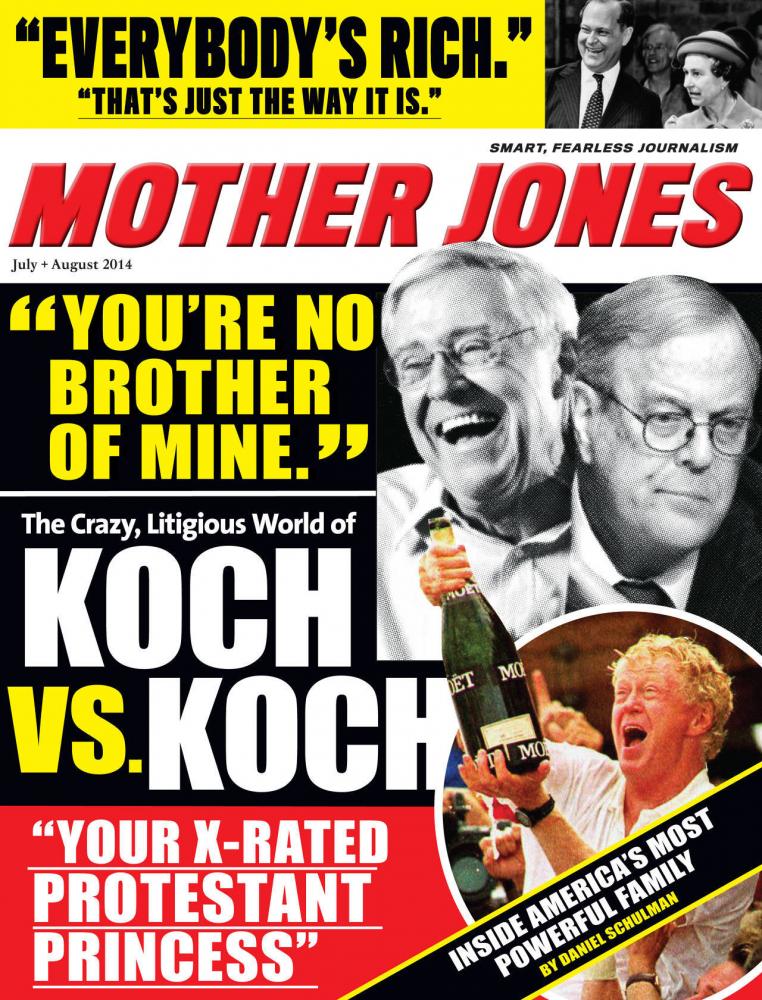
On the July/August 2014 Mother Jones magazine cover, you will not find the clean serif typeface like that on its previous covers. Instead, you will find a bright, red and yellow cover with a bold typeface: a parody of a tabloid magazine. Newman says about the cover, “The parody, designed by creative director Ivylise Simones, is spot on, with just the right mix of funkiness and visual chaos. The design holds nothing back, right down to the Mother Jones logo, which was redesigned for this issue to reflect a tabloid feel. The result is a cover that is fun, engaging, provocative and viral-ready. It takes a strong partnership between the editors and the visual team to create this kind of high-level, sophisticated cover design and it works brilliantly, crafting a set of images that work on so many levels.”
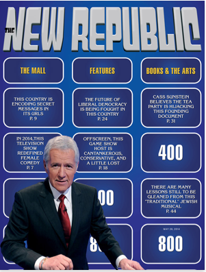
Newman adds, “Conventional wisdom is that a magazine’s logo is sacrosanct, a critical part of the brand that should never be messed with, and I’m sure the Mother Jones logo change will confuse a few readers. Yet, what the magazine gains is a dynamic, comprehensive graphic approach that not only jumps off the page, but is destined to work quite effectively online and across the magazine’s multiple platforms. Apparently altering logos to fit stylized covers has become a trend, because it’s been done recently to great effect by both Bloomberg Businessweek (who have done it at least three times over the past year) and The New Republic.”

 Keeping a magazine cover looking seemingly the same each week or month is not a bad thing; it makes the magazine easy to recognize and comfortable. Magazines can use that sameness to their advantage, as Mother Jones has, and break the norm, causing excitement and wonder as to why that month’s cover is special. As Newman says, creating a cover that is out of the ordinary will create buzz “online and across the magazine’s multiple platforms.”
When The New Republic featured Jeopardy TV host Alex Trebek as its cover story, the magazine “designed itself to look like the famous Jeopardy game board, altering its logo to mimic the show’s distinctive trademark.”

 Newman also writes, “In early June, Bloomberg Businessweek published a story on progressive economist-of-the-moment Thomas Piketty designed to look like a teen fan magazine, complete with a bubble gum logo and small photos of both Justin Bieber and Karl Marx. Both covers take complicated, unsexy topics, but with graphic stylization they turned them into dynamic, pulsating covers, and the same is true with this Mother Jones cover. Of course, there’s a long history of magazines designing covers to look like LP covers, posters, books, product packaging and more. It’s very exciting that magazines that cover topics that are generally not considered flashy and cool (politics and business) are creating some of the liveliest, hip and memorable covers.”
Newman also raises the question as to why it seems that the covers of more liberal magazines seem to “look so much better and smarter than their conservative counterparts.” This may have to do with political ideology, or it may just be a simple design choice. Nonetheless, using unconventional covers can definitely have an effect on a magazine’s buzz.


